Fall colors aren’t just for leaf-peeping and pumpkin patches. The warm, grounded palette of autumn, burnt orange, deep rust, golden ochre, sage green, translates remarkably well to interior spaces, offering richness without the heaviness of darker winter tones. Whether someone’s planning a full room refresh or just swapping out throw pillows, understanding how to work with fall hues can add warmth and depth to a home. This guide breaks down practical color combinations, room-specific applications, and how to integrate autumn tones into existing decor without starting from scratch.
Table of Contents
ToggleKey Takeaways
- Fall color schemes featuring burnt orange, terracotta, sage green, and earth tones work year-round in interior design because they’re rooted in natural materials and pair seamlessly with existing home finishes.
- Start with low-commitment textiles like throw blankets and pillow covers to test a fall color palette before committing to paint or permanent changes.
- Fall color schemes adapt to any home style—from rustic farmhouse with bold burnt orange to modern minimalist with muted terracotta and sage green accents.
- Limit bold fall colors to single accent walls, focal points, or smaller spaces like powder rooms and home offices to avoid overwhelming a room.
- Warm metals like brass and copper complement fall color palettes better than chrome, making hardware and fixture upgrades a high-impact design move.
- Muted fall tones in bedrooms and bathrooms create a warm, restful environment without requiring cool grays or blues to balance the space.
Why Fall Color Palettes Work Year-Round in Interior Design
Fall color schemes lean heavily on earth tones, ochre, terracotta, rust, olive, warm taupe, which are inherently neutral. Unlike seasonal pastels or bold summer brights, these hues don’t scream “temporary.” They’re rooted in natural materials: clay, dried grasses, aged wood, stone. That makes them easier to layer into a home’s existing finishes.
From a design standpoint, warm autumn tones create visual weight without overwhelming a space. A terracotta accent wall, for example, adds warmth and depth but doesn’t dominate the way a saturated jewel tone might. These colors also play well with both cool and warm lighting. Incandescent or warm LED bulbs (2700K–3000K) enhance the golden undertones, while cooler daylight bulbs keep them from skewing too orange.
Another practical advantage: fall palettes pair seamlessly with wood trim, exposed beams, and natural flooring, common elements in older homes and new construction alike. Designers often recommend these colors for spaces with oak, walnut, or reclaimed wood because the warm undertones don’t clash with the wood’s natural grain. That’s a big reason why interior design inspiration often features earth-toned palettes in both traditional and contemporary settings.
Classic Warm Fall Color Schemes for Every Room
Rustic Harvest: Burnt Orange, Deep Red, and Golden Yellow
This is the quintessential autumn palette, the one most people picture when they think “fall colors.” It’s bold, warm, and works best in spaces with plenty of natural light or where a cozy, enveloping feel is the goal.
Paint application: Use burnt orange (think Benjamin Moore’s Buttered Yam or Sherwin-Williams’ Copper Mountain) as an accent wall in a living room or dining area. Pair it with trim in a warm white or cream, not stark white, which will make the orange look too aggressive. Deep red works well in smaller doses: a feature wall behind a wood stove, or as a ceiling color in a den with wood paneling.
Material pairings: This scheme pairs naturally with brass or oil-rubbed bronze hardware, leather upholstery, and wool textiles. Golden yellow works best as an accent, throw pillows, a runner, or framed art, rather than a wall color, which can read as too intense in most residential spaces.
Where it works: Rooms with rustic or farmhouse styles, spaces with exposed brick, or homes with a lot of natural wood. It’s less suited to minimalist or Scandinavian interiors, where the saturation can feel out of place.
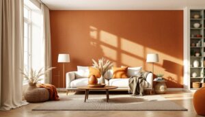
Modern Autumn: Terracotta, Sage Green, and Cream
This palette takes the warmth of fall but dials back the saturation, resulting in a more contemporary, livable scheme. Terracotta and sage have become go-to colors in modern interiors because they’re warm without being loud.
Paint application: Terracotta works beautifully as a full-room color in bedrooms, home offices, or powder rooms. Look for muted versions like Farrow & Ball’s Red Earth or Behr’s Canyon Dusk. Sage green (Benjamin Moore’s October Mist or Sherwin-Williams’ Clary Sage) is an excellent choice for kitchens, bathrooms, or any room where a calming, organic feel is desired. Cream serves as the neutral anchor, use it on trim, ceilings, and adjacent walls to keep the space from feeling too monochromatic.
Material pairings: This palette loves natural textures: linen curtains, jute rugs, matte black or brushed nickel fixtures, and light wood furniture (maple, ash, or whitewashed oak). Avoid high-gloss finishes, which can clash with the matte, earthy vibe.
Where it works: Mid-century modern homes, open-plan spaces, and rooms with lots of white or light-colored cabinetry. It’s also ideal for smaller spaces, as the muted tones don’t visually shrink the room the way darker, more saturated colors can.
How to Incorporate Fall Colors into Your Home Decor
Start with textiles. The lowest-commitment way to test a fall palette is through removable elements: throw blankets, pillow covers, area rugs, and curtains. A rust-colored wool throw or a set of terracotta linen pillow covers can shift the feel of a neutral room without paint or permanent changes. Look for natural fibers, cotton, linen, wool, which reinforce the organic quality of autumn tones.
Accent walls and focal points. If paint is in the plan, limit bold fall colors to a single accent wall or a feature like a built-in bookshelf, fireplace surround, or kitchen island. One gallon of paint typically covers 350–400 square feet with one coat, but deeper, more saturated colors often require two coats for even coverage. Always prime first when going from a light color to a dark or saturated one: it’ll save time and material.
Artwork and decor. Framed prints, pottery, and decorative objects in fall hues can anchor a color scheme without requiring a full room overhaul. A large canvas with burnt orange and cream tones, for example, can justify pulling those colors into pillows or a rug. Ceramic vases, wooden bowls, and woven baskets in warm tones add texture and color without competing for attention.
Hardware and fixtures. Swapping out cabinet pulls, light fixtures, or curtain rods is a small change with outsized impact. Warm metals, brass, copper, bronze, complement fall palettes better than chrome or polished nickel. A set of brass drawer pulls or a matte black faucet can tie a room’s color scheme together, especially when working with terracotta or rust tones.
Seasonal flexibility. One advantage of fall colors is that they transition well. Terracotta and sage, for example, work just as well in spring and summer when paired with lighter linens and greenery. Many designers integrate designer-approved fall decor ideas that emphasize layering textures and tones rather than relying on overtly seasonal motifs like pumpkins or leaves.
Fall Color Schemes for Specific Spaces
Living rooms: This is where warm fall palettes shine. A burnt orange or terracotta accent wall behind a sofa, paired with cream or warm gray on adjacent walls, creates a cozy focal point. Layer in a jute or wool rug, wood coffee table, and linen or velvet upholstery in complementary tones. Avoid overloading the space with pattern, solid colors or subtle textures work best to let the palette breathe.
Kitchens: Sage green cabinetry has become a popular choice, especially in kitchens with butcher block countertops or open shelving. Pair it with brass or matte black hardware and a cream or white backsplash (subway tile, for instance). If painting cabinets, use a durable satin or semi-gloss finish to withstand moisture and cleaning. Expect to apply a bonding primer (like Benjamin Moore’s STIX) if working over glossy or previously finished surfaces.
Bedrooms: Muted fall tones, terracotta, warm taupe, soft ochre, create a restful environment without the coolness of grays or blues. Paint three walls in a warm neutral and one in a deeper autumn tone, or go monochromatic with varying shades of the same hue. Natural linen bedding in cream or off-white keeps the space from feeling too heavy. Add warmth with a wool throw, wood nightstands, and warm-toned lighting (table lamps with fabric shades diffuse light nicely).
Bathrooms: Small spaces can handle more saturated color. A powder room painted in a deep rust or terracotta feels intimate rather than cramped. Pair it with brass or matte black fixtures, a wood-framed mirror, and white or cream tiles. In larger bathrooms, consider sage green walls with white wainscoting or beadboard for a classic, layered look.
Home offices: Warm earth tones can make a workspace feel grounded without being distracting. Terracotta or ochre on one wall, with the rest in cream or warm white, provides visual interest without overwhelming the senses. For more ideas on styling functional spaces, home styling guides often feature office setups that balance color with productivity.
Pairing Fall Colors with Existing Home Styles
Farmhouse and rustic: Fall palettes are a natural fit. Burnt orange, deep red, and mustard yellow pair effortlessly with shiplap, reclaimed wood, and vintage or distressed finishes. Use these colors liberally, on walls, in textiles, and through decor.
Mid-century modern: Stick to the muted side of the fall spectrum: terracotta, ochre, olive green. These tones complement teak and walnut furniture, clean lines, and the understated aesthetic of mid-century design. Avoid overly saturated reds or oranges, which can feel out of step with the style’s restraint.
Contemporary and minimalist: Use fall colors as subtle accents rather than dominant features. A single terracotta pillow on a neutral sofa, a sage green vase on a white shelf, or a muted ochre throw. The goal is to add warmth without disrupting the clean, uncluttered aesthetic.
Traditional and transitional: These styles handle a range of fall tones, from deep reds and golds to softer creams and taupes. Layer in pattern, paisley, damask, plaid, in autumn hues to add richness. Dark wood furniture, crown molding, and classic fixtures all support a warmer color palette.
Craftsman and bungalow: These homes often feature built-in cabinetry, wood trim, and natural materials, all of which pair beautifully with fall colors. Use warm, earthy tones on walls to highlight architectural details. Avoid stark white, which can feel too modern and cold against the home’s original character.
Safety note: When painting, always ensure proper ventilation. Open windows, use fans, and wear a respirator mask rated for organic vapors if working with oil-based paints or high-VOC primers. Dust masks won’t cut it. Keep paint cans sealed and store them away from heat sources.